How to Test Responsive Web Design on Different Devices
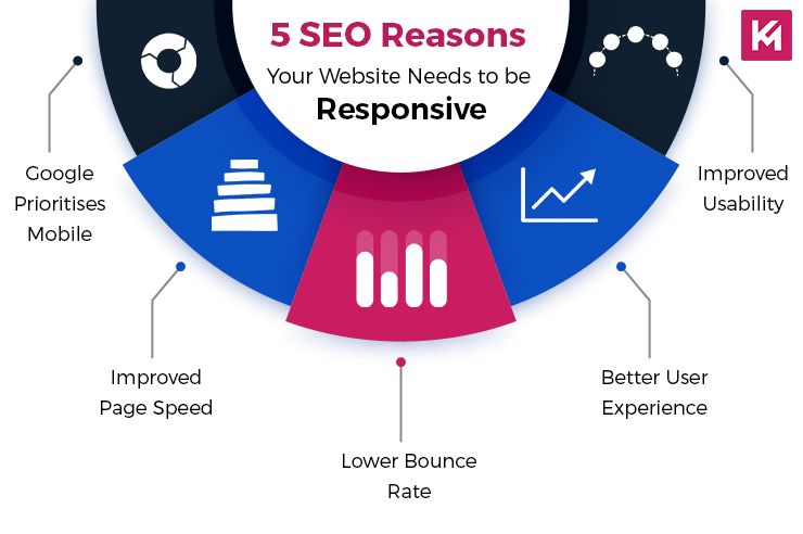
One of the key aspects of web design is ensuring that your website looks great and functions properly on all devices, regardless of screen size. This is where responsive web design comes in. Responsive web design is a design approach that allows websites to adapt to different screen sizes and resolutions, providing optimal user experience on desktops, laptops, tablets, and smartphones.
Why Responsive Web Design is Important
In today’s digital age, people access websites from a variety of devices. According to Statista, mobile devices accounted for 53.3% of global website traffic in the first quarter of 2021. With such a significant portion of users browsing on mobile devices, it’s crucial for websites to be responsive to provide a seamless experience for all users.
Testing Responsive Web Design
Testing your website on different devices is essential to ensure that it looks and functions as intended across various platforms. Here are some steps to test responsive web design on different devices:
1. Use Responsive Design Tools
There are several tools available that can help you test your website’s responsiveness on different devices. Tools like BrowserStack, Responsinator, and Google’s Mobile-Friendly Test allow you to simulate how your website will appear on various devices, making it easier to identify any issues and make necessary adjustments.
2. Test across Different Browsers
In addition to testing on different devices, it’s important to test your website across different browsers. Different browsers may render websites differently, so it’s crucial to ensure that your website looks consistent and functions properly on popular browsers like Chrome, Firefox, Safari, and Edge.
3. Utilize Device Emulators
Device emulators allow you to test how your website will appear on specific devices without actually owning the physical devices. Emulators like Chrome DevTools and Xcode Simulator enable you to simulate various screen sizes and resolutions, giving you a better idea of how your website will look on different devices.
4. Conduct User Testing
User testing involves getting feedback from real users who access your website on different devices. By observing how users interact with your website and gathering their feedback, you can identify any usability issues and make necessary improvements to enhance the overall user experience.
Common Responsive Design Issues
Despite your best efforts, there may still be issues that arise when testing responsive web design. Some common responsive design issues include:
Text or images overlapping on smaller screens
Buttons or links being too small to tap on touchscreens
Content being cut off or hidden on certain devices
By identifying and addressing these issues during the testing phase, you can ensure that your website is optimized for all devices and provides a seamless user experience.
Conclusion
Testing responsive web design on different devices is crucial to ensuring that your website is user-friendly and accessible to all users, regardless of the device they are using. By utilizing responsive design tools, testing across different browsers, using device emulators, and conducting user testing, you can identify and address any issues that may arise, ultimately providing a positive user experience for all visitors to your website.
Remember, responsive web design is not a one-time task but an ongoing process. Regular testing and optimization are necessary to keep your website up-to-date and ensure that it continues to meet the needs and expectations of your users.


