Understanding Breakpoints in Responsive Web Design
Responsive web design is essential for creating websites that look great and function smoothly on all devices, from desktop computers to smartphones and tablets. One of the key elements of responsive web design is the use of breakpoints, which allow designers to adjust the layout of a website based on the screen size and resolution of the device being used.
What are Breakpoints?
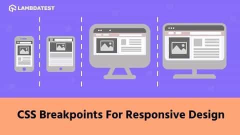
Breakpoints are specific points in a website’s design where the layout shifts to accommodate different screen sizes. By setting breakpoints, designers can control how the elements on a webpage are displayed, ensuring that users have a positive experience regardless of the device they are using to access the site.
Breakpoints are typically defined using CSS media queries, which allow designers to target specific screen sizes and apply custom styles to elements on the page. For example, a designer may set a breakpoint at 768 pixels to adjust the layout for tablets, and another breakpoint at 1024 pixels for large desktop screens.
Why are Breakpoints Important?
Breakpoints are crucial for ensuring that a website is responsive and user-friendly on all devices. Without breakpoints, a website may appear distorted or difficult to navigate on smaller screens, leading to a poor user experience and potentially driving away visitors.
By using breakpoints, designers can create a seamless experience for users, with content and navigation elements adjusting dynamically to fit the screen size. This not only enhances the user experience but also improves the website’s performance and search engine rankings.
Best Practices for Setting Breakpoints
When setting breakpoints for a responsive website, it’s important to consider the most common screen sizes and resolutions used by visitors. Some best practices for setting breakpoints include:
Start with a mobile-first approach: Design the website layout for mobile devices first, then add breakpoints for larger screens.
Use the viewport meta tag: Set the viewport meta tag in the website’s <head> section to ensure that the site displays correctly on all devices.
Test, test, test: Regularly test the website on different devices to ensure that the breakpoints are working as intended.
Responsive Web Design Tools
There are many tools available to help designers create and test responsive websites with breakpoints. Some popular tools include:
Bootstrap: Bootstrap is a front-end framework that includes built-in responsive classes and breakpoints for easy implementation.
Adobe XD: Adobe XD is a design tool that allows designers to create responsive prototypes and test breakpoints visually.
Chrome DevTools: Chrome DevTools offers a responsive design mode that allows designers to test breakpoints and view the website on different devices.
Conclusion
Breakpoints are a vital component of responsive web design, allowing designers to control how a website appears on different devices. By setting breakpoints strategically and testing the website on various devices, designers can create a seamless user experience that adapts to the user’s screen size and resolution. Incorporating breakpoints into your web design process will help you create websites that are visually appealing, functional, and user-friendly on all devices.
For more information on breakpoints and responsive web design, reach out to our team of experts.


